Flutter 常用的Widget
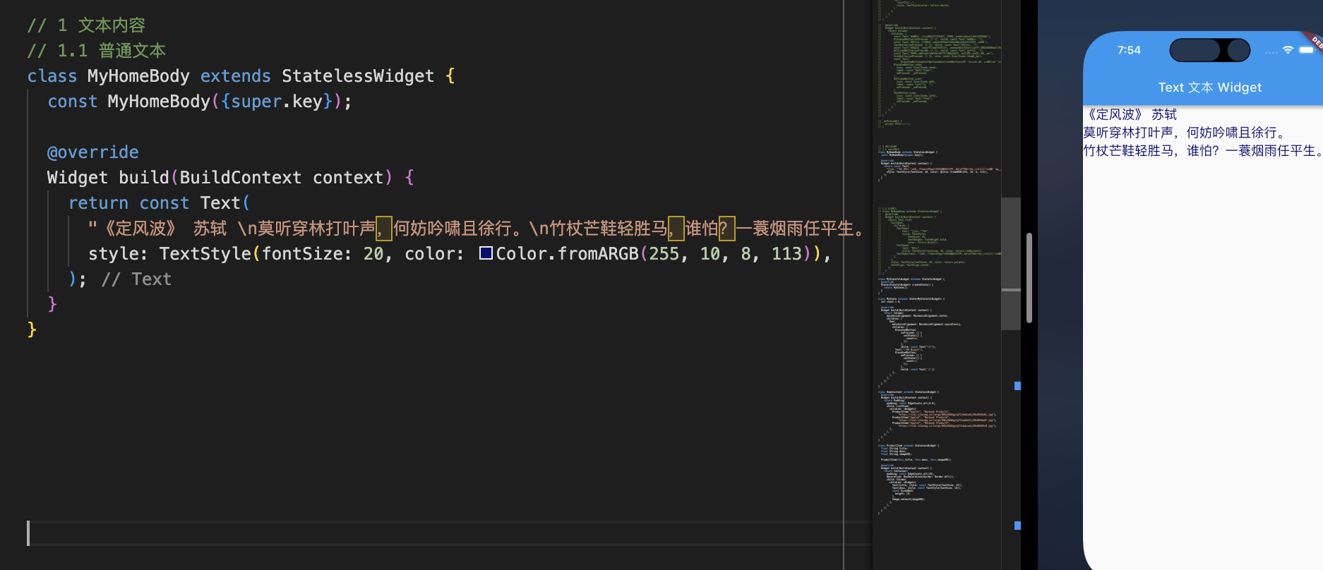
1.Text
控制显示的分成两类:
- 控制文本布局的参数: 如文本对齐方式 textAlign、文本排版方向 textDirection,文本显示最大行数 maxLines、文本截断规则 overflow 等等,这些都是构造函数中的参数;
- 控制文本样式的参数: 如字体名称 fontFamily、字体大小 fontSize、文本颜色 color、文本阴影 shadows 等等,这些参数被统一封装到了构造函数中的参数 style 中
1 | class MyHomeBody extends StatelessWidget { |
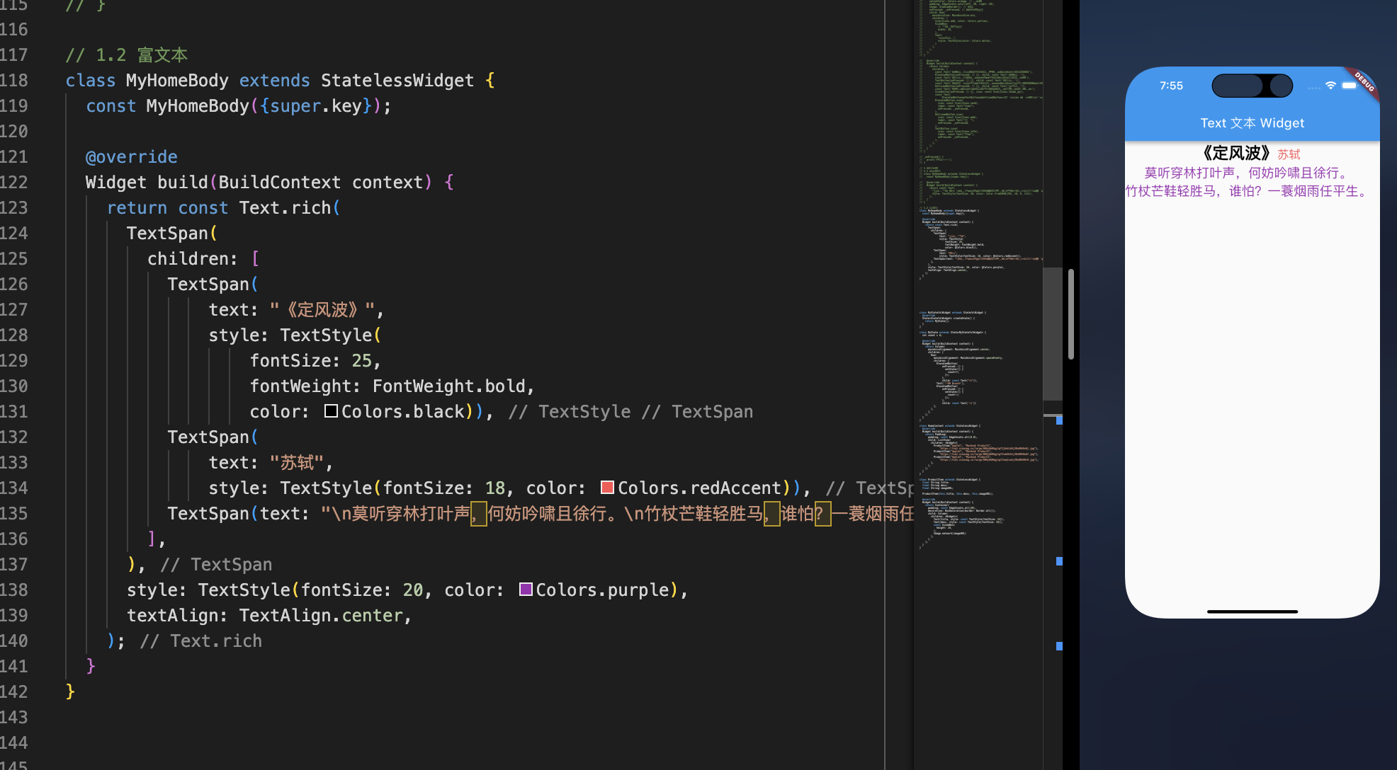
1.2 富文本
1 | class MyHomeBody extends StatelessWidget { |
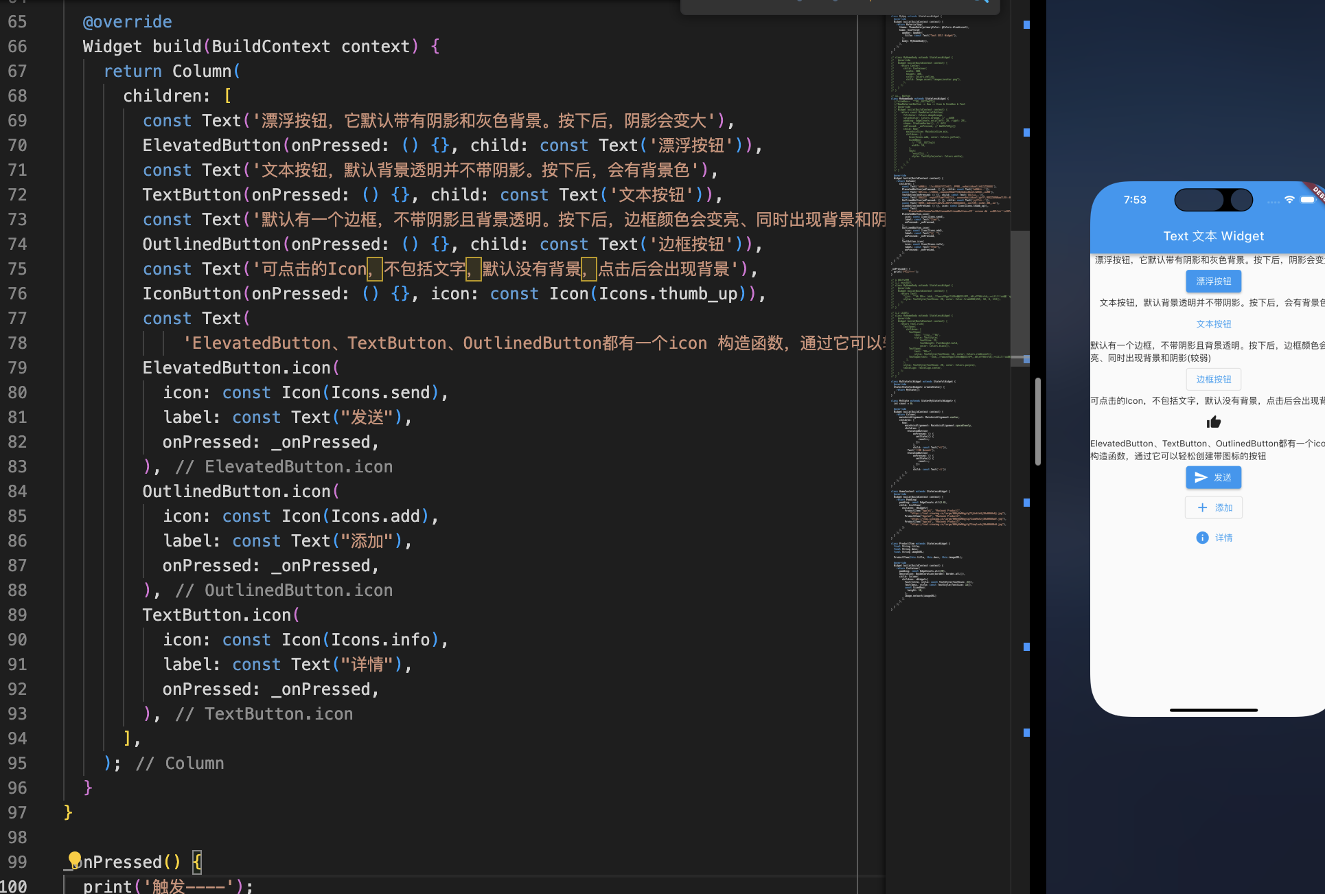
2.Button
2.1 默认样式
1 | class MyHomeBody extends StatelessWidget { |
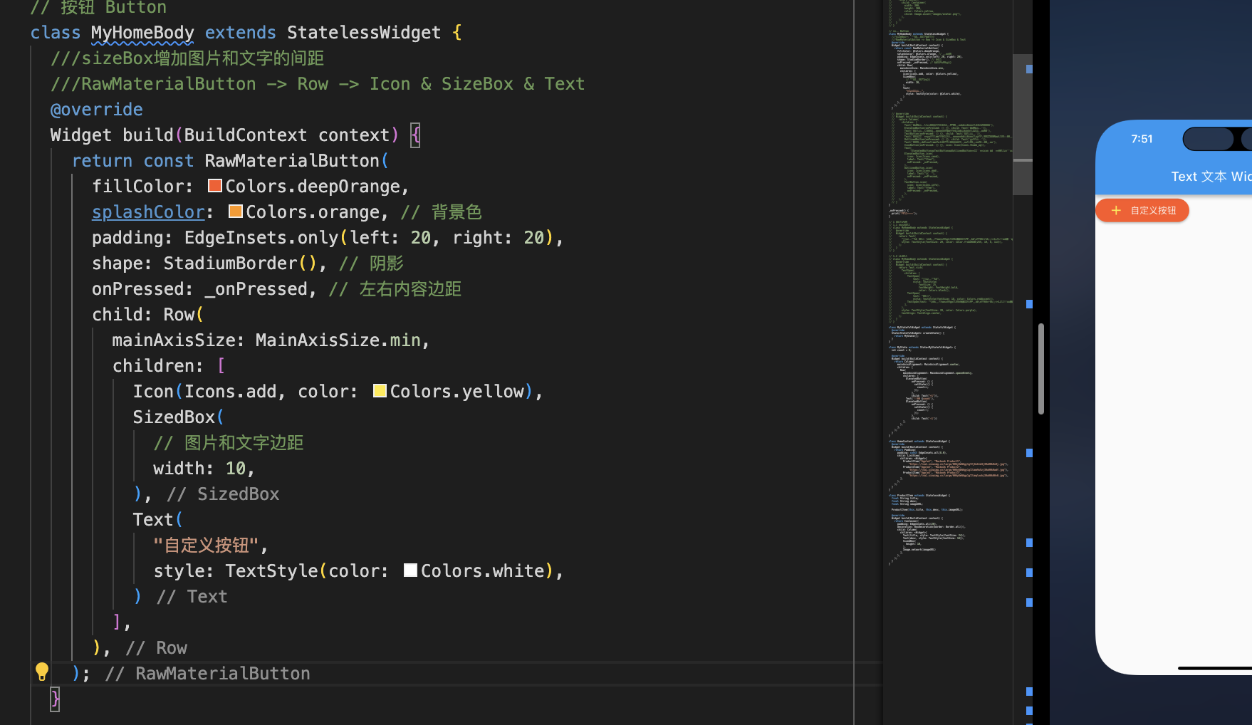
2.2 自定义样式
1 | class MyHomeBody extends StatelessWidget { |
3.Image
- 加载本地图片
- 加载网络图片
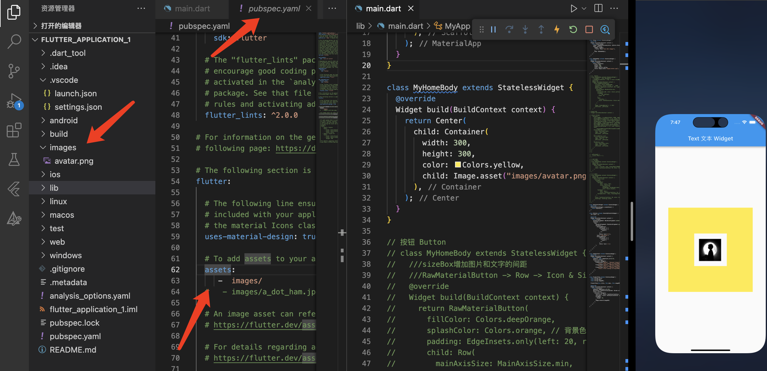
3.1 加载本地图片
1.工程目录下新建文件夹 images
2.pubspec.yaml 配置方式,asserts 要注意缩进,可以声明图片等相对目录,也可以声明图片文件夹1
2
3assets:
- images/ # 声明图片文件夹,该文件夹下的图片都会被声明
- images/avatar.png # 声明图片相对路径
1 | Image.asset('images/avatar.png') |
1 | class MyHomeBody extends StatelessWidget { |
3.2 加载网络图片
1 | const Image({ |
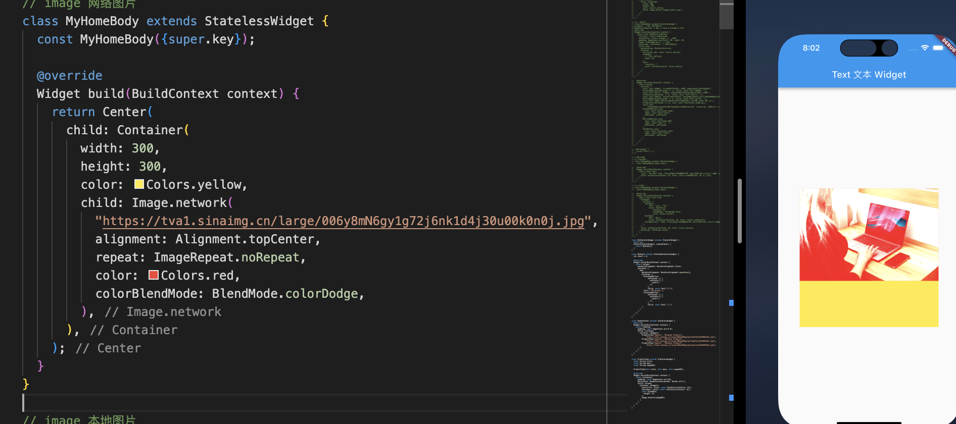
1 | // image 网络图片 |
4.TextField
4.1 基本使用
常见的属性
- keyboardType:键盘的类型
- style:设置样式
- textAlign:文本对齐方式
- maxLength:最大显示行数
- decoration:用于设置输入框相关的样式
- icon:设置左边显示的图标
- labelText:在输入框上面显示一个提示的文本
- hintText:显示提示的占位文字
- border:输入框的边框,默认底部有一个边框,可以通过InputBorder.none删除掉
- filled:是否填充输入框,默认为false
- fillColor:输入框填充的颜色
- controller:
- onChanged:监听输入框内容的改变,传入一个回调函数
- onSubmitted:点击键盘中右下角的down时,会回调的一个函数
这是一些简单的属性,其他用到的时候可以再查
4.2 获取变量的方式
- 定义两个变量,用于保存用户名和密码,然后在
onChange触发时,各自保存一下输入内容。 - 自定义
controller直接获取
controller的作用
- 为绑定的输入框 TextField 预设内容
- 获取 TextField 中输入的内容
- 兼听文字输入变化与焦点变化
如果没有自定义 controller ,内部会自动生成一个 TextEditingController
textfield 内部实现1
2
3
4
5
6
7
8
9
10
11
12
void initState() {
super.initState();
_selectionGestureDetectorBuilder = _TextFieldSelectionGestureDetectorBuilder(state: this);
if (widget.controller == null) {
_createLocalController();
}
_effectiveFocusNode.canRequestFocus = widget.canRequestFocus && _isEnabled;
_effectiveFocusNode.addListener(_handleFocusChanged);
}
}
例子1
2
3
4
5
6
7
8
9
10
11
12
13
14
15
16
17
18
19
20
21
22
23
24
25
26
27
28
29
30
31
32
33
34
35
36
37
38
39
40
41
42
43
44
45
46
47
48
49
50
51
52
53
54
55
56
57
58class MyHomeBody extends StatelessWidget {
const MyHomeBody({super.key});
Widget build(BuildContext context) {
return Container(
padding: const EdgeInsets.all(20),
child: Column(
mainAxisAlignment: MainAxisAlignment.center,
children: <Widget>[TextFieldDemo()],
),
);
}
}
class TextFieldDemo extends StatefulWidget {
_TextFieldDemoState createState() => _TextFieldDemoState();
}
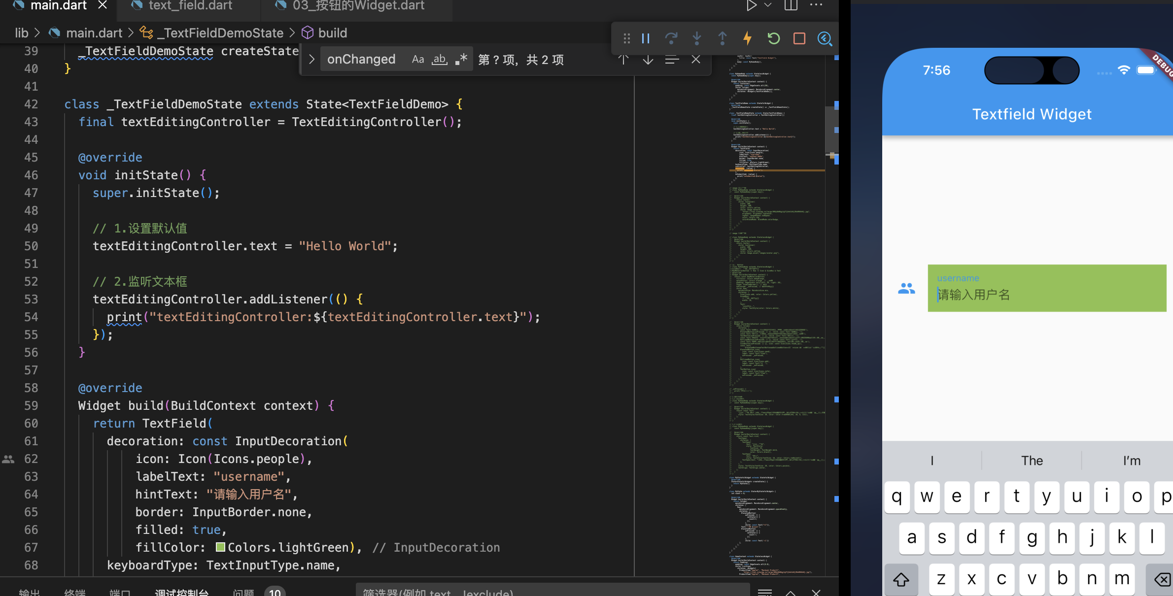
class _TextFieldDemoState extends State<TextFieldDemo> {
final textEditingController = TextEditingController();
void initState() {
super.initState();
// 1.设置默认值
textEditingController.text = "Hello World";
// 2.监听文本框
textEditingController.addListener(() {
print("textEditingController:${textEditingController.text}");
});
}
Widget build(BuildContext context) {
return TextField(
decoration: const InputDecoration(
icon: Icon(Icons.people),
labelText: "username",
hintText: "请输入用户名",
border: InputBorder.none,
filled: true,
fillColor: Colors.lightGreen),
keyboardType: TextInputType.name,
controller: textEditingController,
onChanged: (value) {
print("onChanged:$value");
},
onSubmitted: (value) {
print("onSubmitted:$value");
},
);
}
}
5.Form
- Form表单也是一个Widget,可以在里面放入我们的输入框。
- 但是Form表单中输入框必须是FormField类型的
- 我们查看刚刚学过的TextField是继承自StatefulWidget,并不是一个FormField类型;
- 我们可以使用TextFormField,它的使用类似于TextField,并且是继承自FormField的;
5.1 保存和获取表单数据
在Flutter如何可以获取一个通过一个引用获取一个StatefulWidget的State对象呢?
通过绑定一个GlobalKey即可
final registerFormKey = GlobalKey<FormState>();
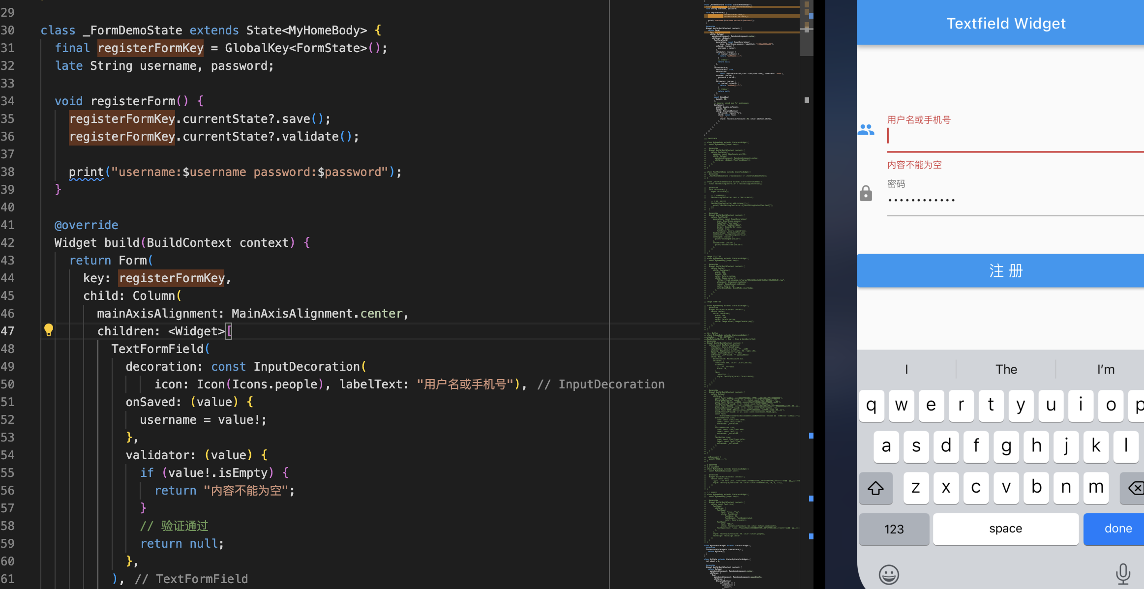
5.2 验证输入内容
1 | 、、、省略 |
示例1
2
3
4
5
6
7
8
9
10
11
12
13
14
15
16
17
18
19
20
21
22
23
24
25
26
27
28
29
30
31
32
33
34
35
36
37
38
39
40
41
42
43
44
45
46
47
48
49
50
51
52
53
54
55
56
57
58
59
60
61
62
63
64
65
66
67
68
69
70
71
72
73
74
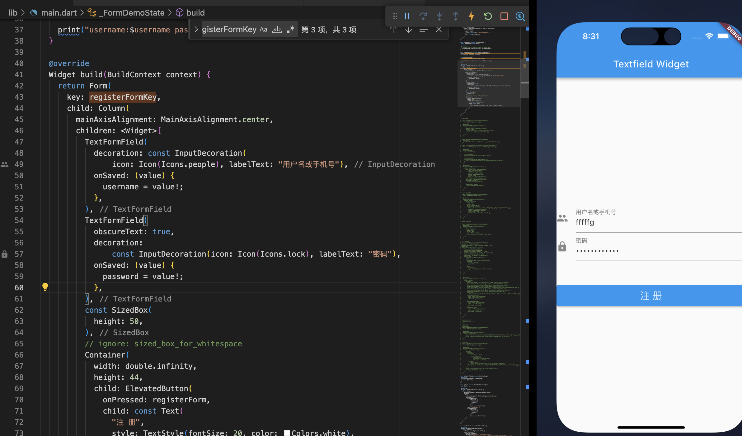
75lass MyHomeBody extends StatefulWidget {
const MyHomeBody({super.key});
// ignore: library_private_types_in_public_api
_FormDemoState createState() => _FormDemoState();
}
class _FormDemoState extends State<MyHomeBody> {
final registerFormKey = GlobalKey<FormState>();
late String username, password;
void registerForm() {
registerFormKey.currentState?.save();
registerFormKey.currentState?.validate();
print("username:$username password:$password");
}
Widget build(BuildContext context) {
return Form(
key: registerFormKey,
child: Column(
mainAxisAlignment: MainAxisAlignment.center,
children: <Widget>[
TextFormField(
decoration: const InputDecoration(
icon: Icon(Icons.people), labelText: "用户名或手机号"),
onSaved: (value) {
username = value!;
},
validator: (value) {
if (value!.isEmpty) {
return "内容不能为空";
}
// 验证通过
return null;
},
),
TextFormField(
obscureText: true,
decoration:
const InputDecoration(icon: Icon(Icons.lock), labelText: "密码"),
onSaved: (value) {
password = value!;
},
validator: (value) {
if (value!.isEmpty) {
return "内容不能为空";
}
// 验证通过
return null;
},
),
const SizedBox(
height: 50,
),
// ignore: sized_box_for_whitespace
Container(
width: double.infinity,
height: 44,
child: ElevatedButton(
onPressed: registerForm,
child: const Text(
"注 册",
style: TextStyle(fontSize: 20, color: Colors.white),
),
),
)
],
),
);
}
}