1.单子布局
单子布局组件的含义是其只有一个子组件,可以通过设置一些属性设置该子组件所在的位置信息等。
比较常用的单子布局组件有:Align、Center、Padding、Container。
1.1 Align
1
2
3
4
5
6
7
| const Align({
super.key,
this.alignment = Alignment.center,
this.widthFactor,
this.heightFactor,
super.child,
})
|
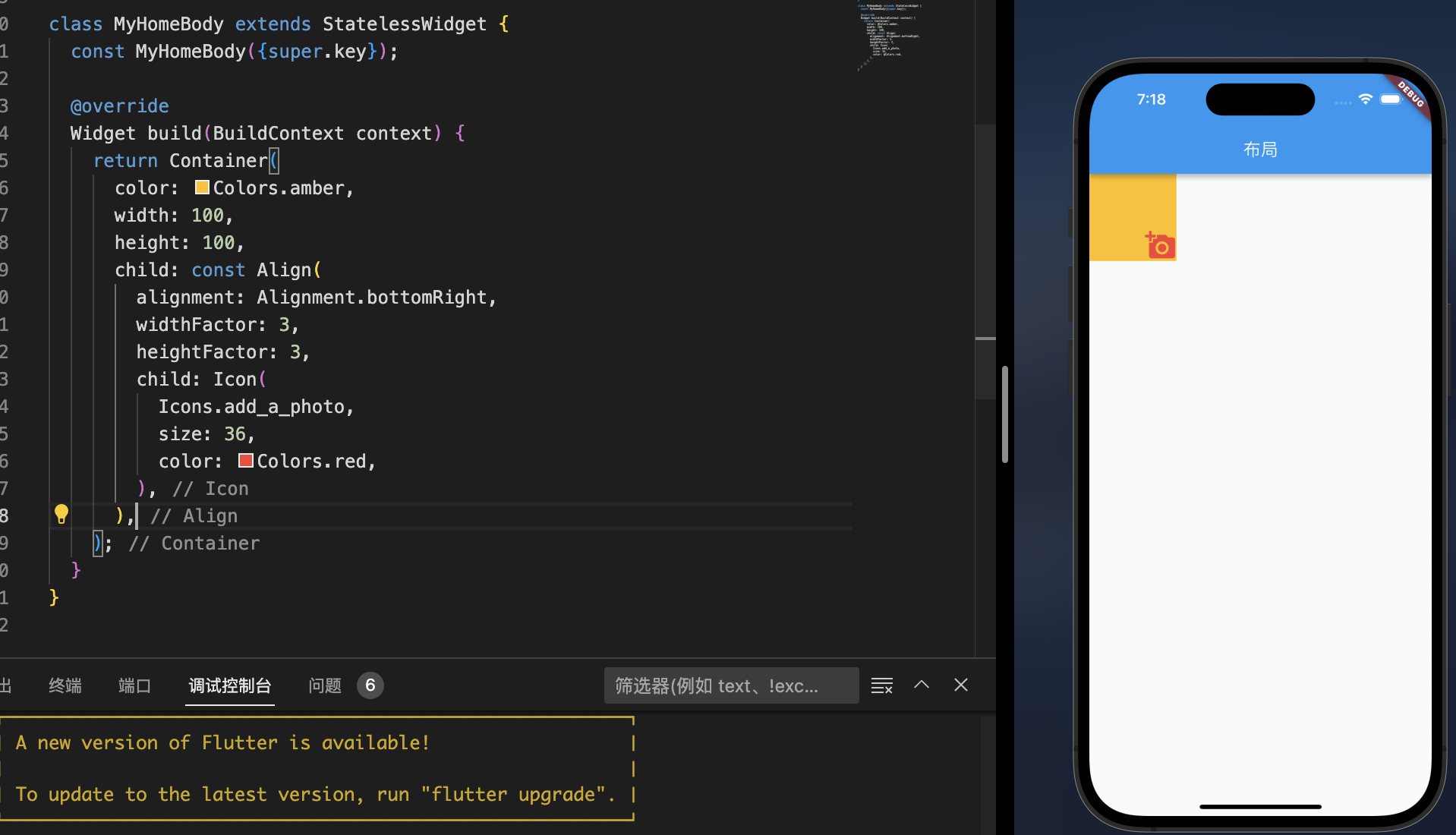
- 因为子组件在父组件中的对齐方式必须有一个前提,就是父组件得知道自己的范围(宽度和高度);
- 如果
widthFactor和heightFactor不设置,那么默认Align会尽可能的大(尽可能占据自己所在的父组件);
- 我们也可以对他们进行设置,比如widthFactor设置为3,那么相对于Align的宽度是子组件跨度的3倍;
简单操作:
1
2
3
4
5
6
7
8
9
10
11
12
13
14
15
16
17
18
19
20
21
22
| class MyHomeBody extends StatelessWidget {
const MyHomeBody({super.key});
@override
Widget build(BuildContext context) {
return Container(
color: Colors.amber,
width: 100,
height: 100,
child: const Align(
alignment: Alignment.bottomRight,
widthFactor: 3,
heightFactor: 3,
child: Icon(
Icons.add_a_photo,
size: 36,
color: Colors.red,
),
),
);
}
}
|
1.2 Center
1
2
3
4
5
6
7
8
9
| class Center extends Align {
const Center({
super.key,
super.widthFactor,
super.heightFactor,
super.child
});
}
|
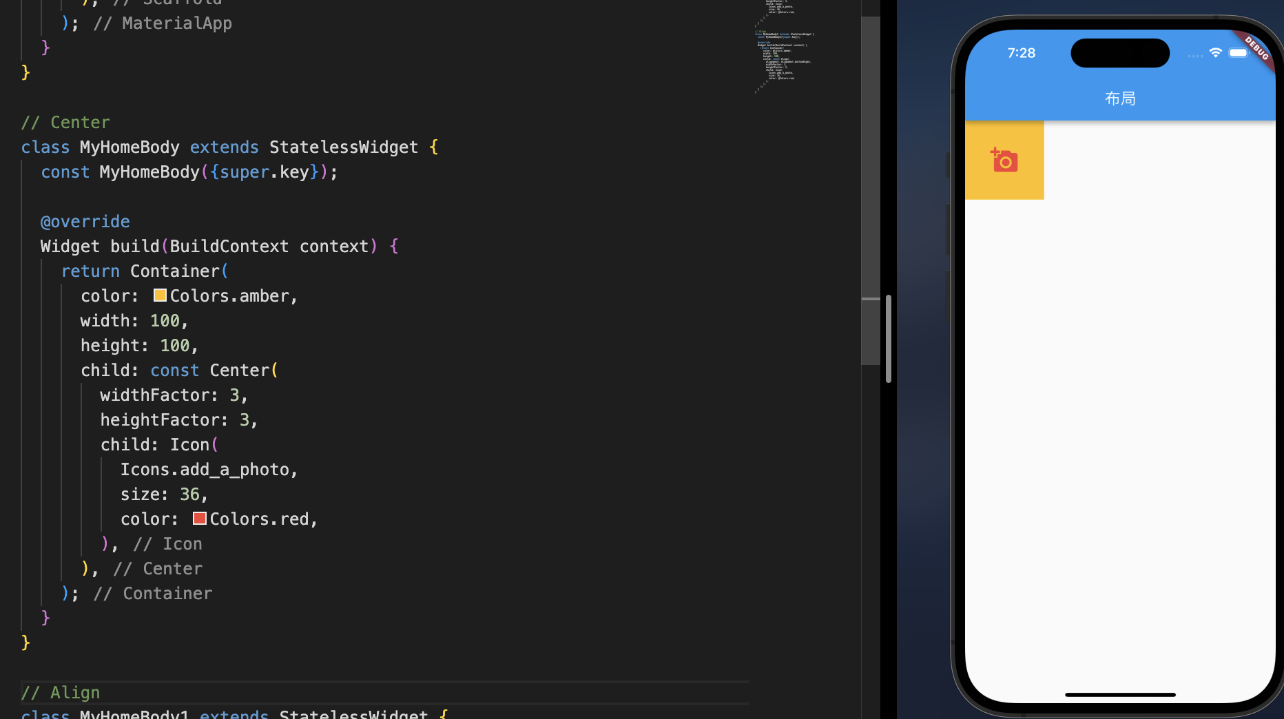
- Center组件继承自Align
- alignment设置为Alignment.center
简单操作:
1
2
3
4
5
6
7
8
9
10
11
12
13
14
15
16
17
18
19
20
21
| class MyHomeBody extends StatelessWidget {
const MyHomeBody({super.key});
@override
Widget build(BuildContext context) {
return Container(
color: Colors.amber,
width: 100,
height: 100,
child: const Center(
widthFactor: 3,
heightFactor: 3,
child: Icon(
Icons.add_a_photo,
size: 36,
color: Colors.red,
),
),
);
}
}
|
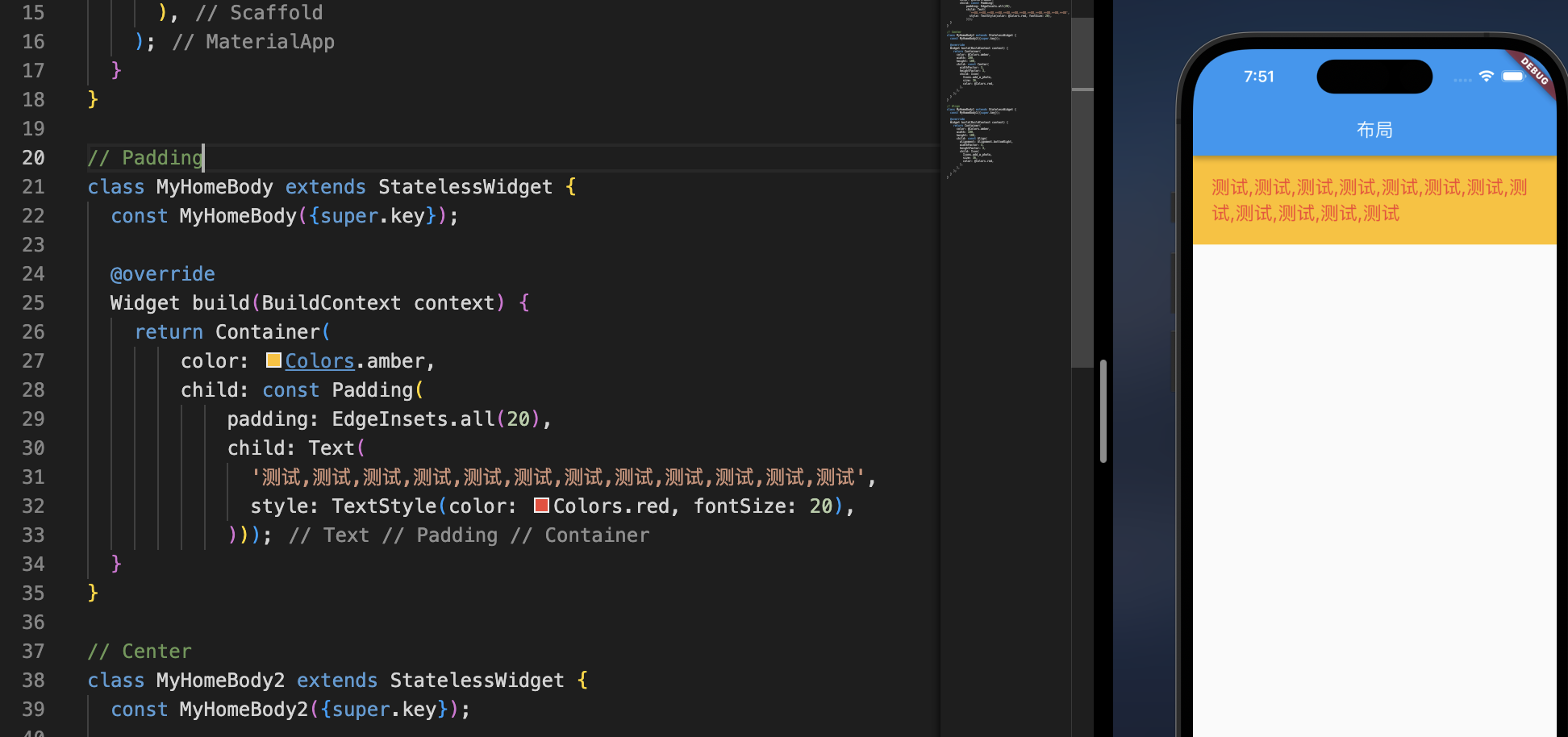
1.3 Padding
Padding 不是一个简单的属性,在这也是一个Widget,有点像是web中的内边距,但是没有margin这种widget,因为也可以使用Padding替代,
1
2
3
4
5
6
7
8
9
10
11
12
13
14
15
| class MyHomeBody extends StatelessWidget {
const MyHomeBody({super.key});
@override
Widget build(BuildContext context) {
return Container(
color: Colors.amber,
child: const Padding(
padding: EdgeInsets.all(20),
child: Text(
'测试,测试,测试,测试,测试,测试,测试,测试,测试,测试,测试,测试',
style: TextStyle(color: Colors.red, fontSize: 20),
)));
}
}
|
1.4 Container
- 类似 iOS中的UIView
- 可以设置背景色、图像、边框、圆角、固定尺寸、内边距、对齐方式
- 使用的频率会比较高
1
2
3
4
5
6
7
8
9
10
11
12
13
14
15
16
| Container({
super.key,
this.alignment,
this.padding,
this.color,
this.decoration,
this.foregroundDecoration,
double? width,
double? height,
BoxConstraints? constraints,
this.margin,
this.transform,
this.transformAlignment,
this.child,
this.clipBehavior = Clip.none,
})
|
其中 decoration 是比较重要的属性
- 它的属性是Decoration,是一个抽象类
- 实现类BoxDecoration来进行实例化
1
2
3
4
5
6
7
8
9
10
| const BoxDecoration({
this.color,
this.image,
this.border,
this.borderRadius,
this.boxShadow,
this.gradient,
this.backgroundBlendMode,
this.shape = BoxShape.rectangle,
})
|
简单操作
1
2
3
4
5
6
7
8
9
10
11
12
13
14
15
16
17
18
19
20
21
22
23
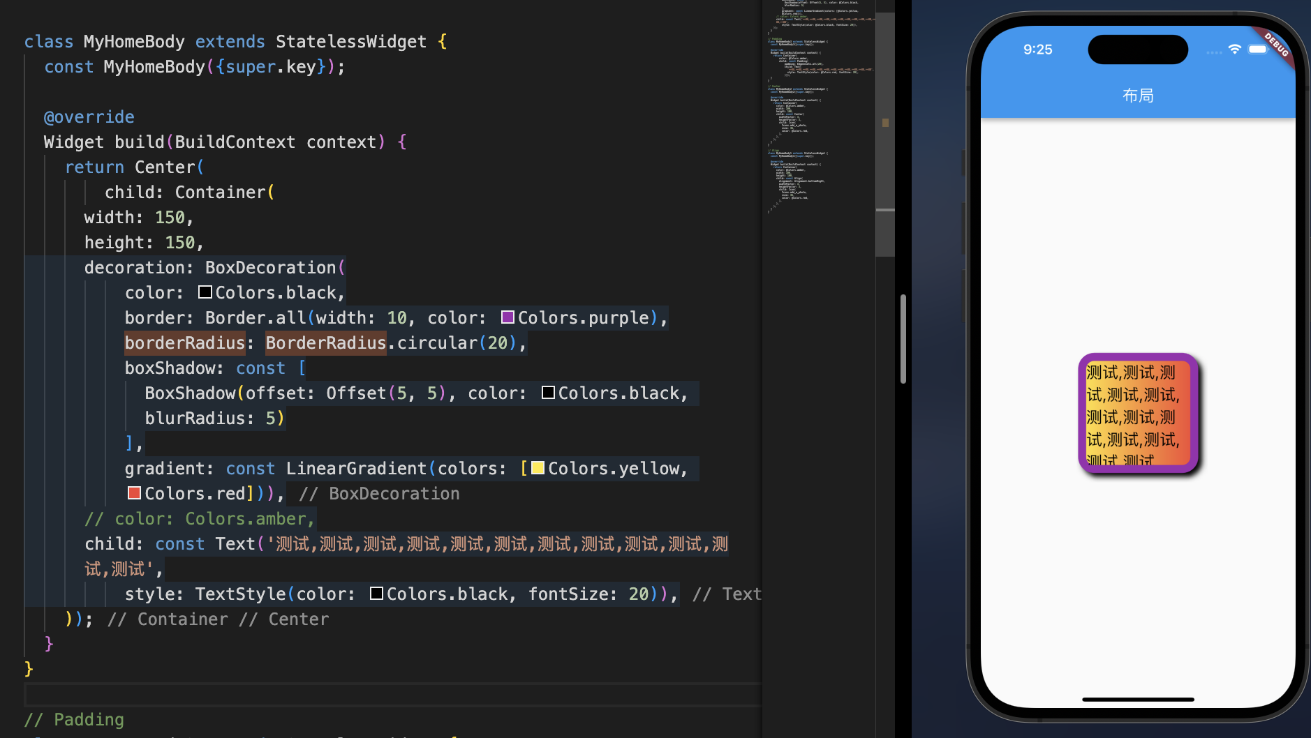
| class MyHomeBody extends StatelessWidget {
const MyHomeBody({super.key});
@override
Widget build(BuildContext context) {
return Center(
child: Container(
width: 150,
height: 150,
decoration: BoxDecoration(
color: Colors.black,
border: Border.all(width: 10, color: Colors.purple),
borderRadius: BorderRadius.circular(20),
boxShadow: const [
BoxShadow(offset: Offset(5, 5), color: Colors.black, blurRadius: 5)
],
gradient: const LinearGradient(colors: [Colors.yellow, Colors.red])),
child: const Text('测试,测试,测试,测试,测试,测试,测试,测试,测试,测试,测试,测试',
style: TextStyle(color: Colors.black, fontSize: 20)),
));
}
}
|
2.多子布局
在开发中,我们经常需要将多个Widget放在一起进行布局,比如水平方向、垂直方向排列,甚至有时候需要他们进行层叠,比如图片上面放一段文字等;
这个时候我们需要使用多子布局组件(Multi-child layout widgets)
比较常用的多子布局组件是Row、Column、Stack,我们来学习一下他们的使用。
2.1 Flex组件
类似iOS中的UIStackView,布局的思想应该是借鉴web flex布局,不过只能在单行、单列上排版,
其中主要认识两个方向,主轴和交叉轴
- Row:横向是主轴,纵向是交叉轴
- Column:纵向是主轴,横向是交叉轴
1
2
3
4
5
6
7
8
9
10
11
12
| const Flex({
super.key,
required this.direction,
this.mainAxisAlignment = MainAxisAlignment.start,
this.mainAxisSize = MainAxisSize.max,
this.crossAxisAlignment = CrossAxisAlignment.center,
this.textDirection,
this.verticalDirection = VerticalDirection.down,
this.textBaseline,
this.clipBehavior = Clip.none,
super.children,
})
|
- direction:设置主轴方向,Axis.horizontal 和 Axis.vertical
2.1.1 Row组件
Row 继承自 Flex,如果是直接确定横向布局,可以直接使用Row
1
2
3
4
5
6
7
8
9
10
| const Row({
super.key,
super.mainAxisAlignment,
super.mainAxisSize,
super.crossAxisAlignment,
super.textDirection,
super.verticalDirection,
super.textBaseline,
super.children,
})
|
- mainAxisSize
1
2
3
4
| enum MainAxisSize {
min,
max,
}
|
mainAxisAlignment
1
2
3
4
5
6
7
8
| enum MainAxisAlignment {
start,
end,
center,
spaceBetween,
spaceAround,
spaceEvenly,
}
|
textDirection
1
2
3
4
| enum TextDirection {
rtl,
ltr,
}
|
crossAxisAlignment
1
2
3
4
5
6
7
| enum CrossAxisAlignment {
start,
end,
center,
stretch,
baseline,
}
|
简单操作
1
2
3
4
5
6
7
8
9
10
11
12
13
14
15
16
17
18
19
20
21
22
23
24
25
26
27
28
29
30
31
32
33
34
35
36
37
38
39
40
41
42
43
44
45
46
47
48
49
| lass MyHomeBody extends StatelessWidget {
const MyHomeBody({super.key});
@override
Widget build(BuildContext context) {
return Flex(direction: Axis.vertical, children: [
const Align(
alignment: Alignment.centerLeft,
child: Text(
'TextDirection.ltr',
style: TextStyle(fontSize: 20),
),
),
Row(
mainAxisAlignment: MainAxisAlignment.start,
crossAxisAlignment: CrossAxisAlignment.start,
mainAxisSize: MainAxisSize.max,
textDirection: TextDirection.ltr,
verticalDirection: VerticalDirection.down,
children: <Widget>[
Container(color: Colors.red, width: 60, height: 60),
Container(color: Colors.blue, width: 80, height: 80),
Container(color: Colors.green, width: 70, height: 70),
Container(color: Colors.orange, width: 100, height: 100),
],
),
const Align(
alignment: Alignment.centerRight,
child: Text(
'TextDirection.rtl',
style: TextStyle(fontSize: 20),
),
),
Row(
mainAxisAlignment: MainAxisAlignment.start,
crossAxisAlignment: CrossAxisAlignment.start,
mainAxisSize: MainAxisSize.max,
textDirection: TextDirection.rtl,
verticalDirection: VerticalDirection.down,
children: <Widget>[
Container(color: Colors.red, width: 60, height: 60),
Container(color: Colors.blue, width: 80, height: 80),
Container(color: Colors.green, width: 70, height: 70),
Container(color: Colors.orange, width: 100, height: 100),
],
),
]);
}
}
|
1
2
3
4
5
6
7
8
9
10
11
12
13
14
15
16
17
18
19
20
21
22
23
24
25
26
27
28
29
30
31
32
33
34
35
36
37
38
39
40
41
42
43
44
45
46
47
48
49
50
51
52
53
54
55
56
57
58
59
60
61
62
63
64
65
66
67
68
69
70
71
72
73
74
75
76
77
78
79
80
81
82
83
84
85
86
87
88
89
90
91
92
93
94
95
96
97
98
99
100
101
102
103
104
105
106
107
108
109
110
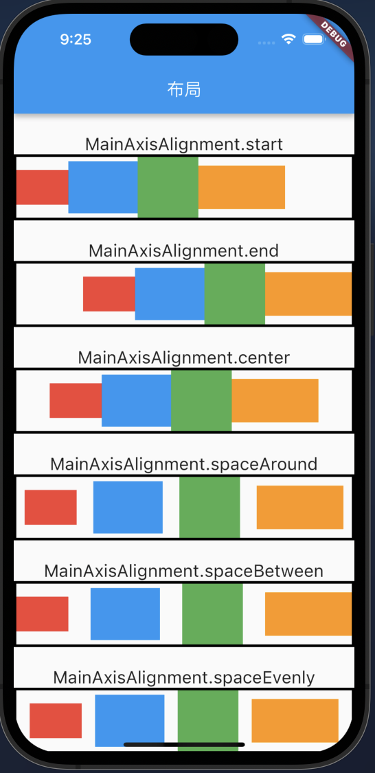
| class MyHomeBody extends StatelessWidget {
const MyHomeBody({super.key});
@override
Widget build(BuildContext context) {
var widgets = [
Container(color: Colors.red, width: 60, height: 40),
Container(color: Colors.blue, width: 80, height: 60),
Container(color: Colors.green, width: 70, height: 70),
Container(color: Colors.orange, width: 100, height: 50),
];
return Flex(
direction: Axis.vertical,
children: [
const Spacer(
flex: 1,
),
const Text(
'MainAxisAlignment.start',
style: TextStyle(fontSize: 20),
),
Container(
decoration: BoxDecoration(
border: Border.all(width: 3, color: Colors.black),
),
child: Row(
mainAxisAlignment: MainAxisAlignment.start,
children: widgets,
),
),
const Spacer(
flex: 1,
),
const Text(
'MainAxisAlignment.end',
style: TextStyle(fontSize: 20),
),
Container(
decoration:
BoxDecoration(border: Border.all(width: 3, color: Colors.black)),
child: Row(
mainAxisAlignment: MainAxisAlignment.end,
children: widgets,
),
),
const Spacer(
flex: 1,
),
const Text(
'MainAxisAlignment.center',
style: TextStyle(fontSize: 20),
),
Container(
decoration:
BoxDecoration(border: Border.all(width: 3, color: Colors.black)),
child: Row(
mainAxisAlignment: MainAxisAlignment.center,
children: widgets,
),
),
const Spacer(
flex: 1,
),
const Text(
'MainAxisAlignment.spaceAround',
style: TextStyle(fontSize: 20),
),
Container(
decoration:
BoxDecoration(border: Border.all(width: 3, color: Colors.black)),
child: Row(
mainAxisAlignment: MainAxisAlignment.spaceAround,
children: widgets,
),
),
const Spacer(
flex: 1,
),
const Text(
'MainAxisAlignment.spaceBetween',
style: TextStyle(fontSize: 20),
),
Container(
decoration:
BoxDecoration(border: Border.all(width: 3, color: Colors.black)),
child: Row(
mainAxisAlignment: MainAxisAlignment.spaceBetween,
children: widgets,
),
),
const Spacer(
flex: 1,
),
const Text(
'MainAxisAlignment.spaceEvenly',
style: TextStyle(fontSize: 20),
),
Container(
decoration:
BoxDecoration(border: Border.all(width: 3, color: Colors.black)),
child: Row(
mainAxisAlignment: MainAxisAlignment.spaceEvenly,
children: widgets,
),
),
],
);
}
}
|
1
2
3
4
5
6
7
8
9
10
11
12
13
14
15
16
17
18
19
20
21
22
23
24
25
26
27
28
29
30
31
32
33
34
35
36
37
38
39
40
41
42
43
44
45
46
47
48
49
50
51
52
53
54
55
56
57
58
59
60
61
62
63
64
65
66
67
68
69
70
71
72
73
74
75
76
77
78
79
80
81
82
83
84
85
86
87
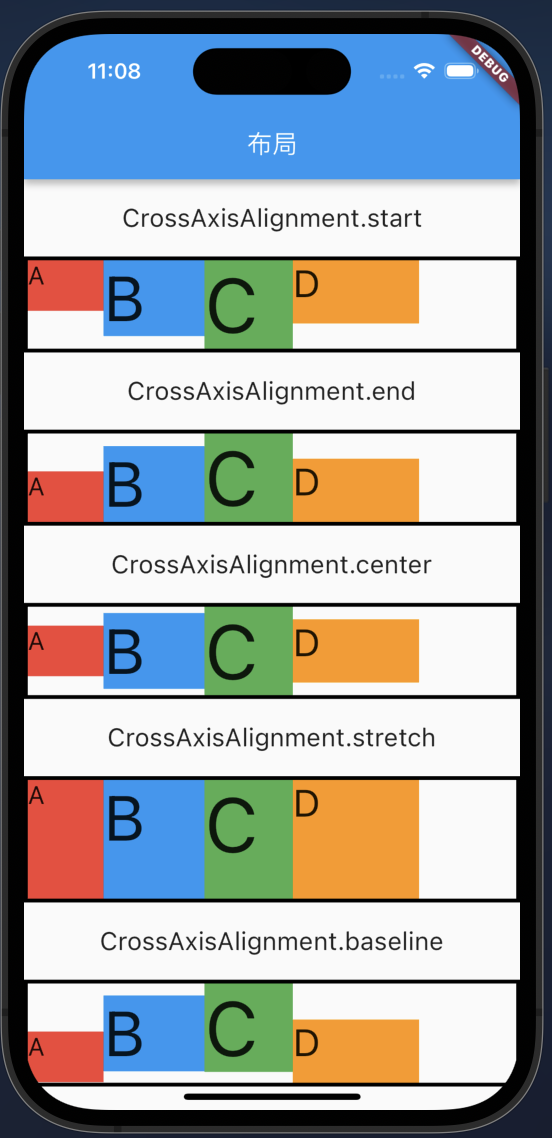
| class MyHomeBody extends StatelessWidget {
const MyHomeBody({super.key});
@override
Widget build(BuildContext context) {
var widgets = [
Container(
color: Colors.red, width: 60, height: 40, child: const Text('A')),
Container(
color: Colors.blue, width: 80, height: 60, child: const Text('B')),
Container(
color: Colors.green, width: 70, height: 70, child: const Text('C')),
Container(
color: Colors.orange, width: 100, height: 50, child: const Text('D')),
];
return Flex(
direction: Axis.vertical,
mainAxisAlignment: MainAxisAlignment.spaceEvenly,
children: [
const Text(
'CrossAxisAlignment.start',
style: TextStyle(fontSize: 20),
),
Container(
decoration: BoxDecoration(
border: Border.all(width: 3, color: Colors.black),
),
child: Row(
crossAxisAlignment: CrossAxisAlignment.start,
children: widgets,
),
),
const Text(
'CrossAxisAlignment.end',
style: TextStyle(fontSize: 20),
),
Container(
decoration:
BoxDecoration(border: Border.all(width: 3, color: Colors.black)),
child: Row(
crossAxisAlignment: CrossAxisAlignment.end,
children: widgets,
),
),
const Text(
'CrossAxisAlignment.center',
style: TextStyle(fontSize: 20),
),
Container(
decoration:
BoxDecoration(border: Border.all(width: 3, color: Colors.black)),
child: Row(
crossAxisAlignment: CrossAxisAlignment.center,
children: widgets,
),
),
const Text(
'CrossAxisAlignment.spaceAround',
style: TextStyle(fontSize: 20),
),
Container(
height: 100,
decoration:
BoxDecoration(border: Border.all(width: 3, color: Colors.black)),
child: Row(
crossAxisAlignment: CrossAxisAlignment.stretch,
children: widgets,
),
),
const Text(
'CrossAxisAlignment.spaceAround',
style: TextStyle(fontSize: 20),
),
Container(
decoration:
BoxDecoration(border: Border.all(width: 3, color: Colors.black)),
child: Row(
crossAxisAlignment: CrossAxisAlignment.baseline,
textBaseline: TextBaseline.ideographic,
children: widgets,
),
)
],
);
}
}
|
2.1.2 Column
参考Row操作
2.2 Wrap
和 Flex 不同的是,支持换行
2.3 Stack
实现组件重叠显示,web中使用绝对定位,iOS使用frame
1
2
3
4
5
6
7
8
| const Stack({
super.key,
this.alignment = AlignmentDirectional.topStart,
this.textDirection,
this.fit = StackFit.loose,
this.clipBehavior = Clip.hardEdge,
super.children,
});
|
- alignment:此参数决定如何去对齐没有定位(没有使用Positioned)或部分定位的子widget。所谓部分定位,在这里特指没有在某一个轴上定位:left、right为横轴,top、bottom为纵轴,只要包含某个轴上的一个定位属性就算在该轴上有定位。
- textDirection:和Row、Wrap的textDirection功能一样,都用于决定alignment对齐的参考系即:textDirection的值为
TextDirection.ltr,则alignment的start代表左,end代表右;textDirection的值为TextDirection.rtl,则alignment的start代表右,end代表左。
- fit:此参数用于决定没有定位的子widget如何去适应Stack的大小。
StackFit.loose表示使用子widget的大小,StackFit.expand表示扩伸到Stack的大小。
- overflow:此属性决定如何显示超出Stack显示空间的子widget,值为
Overflow.clip时,超出部分会被剪裁(隐藏),值为Overflow.visible 时则不会。
Stack会经常和Positioned一起来使用
- 决定组件在Stack中的位置,类似iOS中设置 UIEdgeInsert,设置上下左右的边距
- 设置宽、高
- Positioned只能在Stack中使用
1
2
3
4
5
6
7
8
9
10
| const Positioned({
super.key,
this.left,
this.top,
this.right,
this.bottom,
this.width,
this.height,
required super.child,
})
|
简单操作:
1
2
3
4
5
6
7
8
9
10
11
12
13
14
15
16
17
18
19
20
21
22
23
24
25
26
27
28
29
30
31
32
33
34
35
36
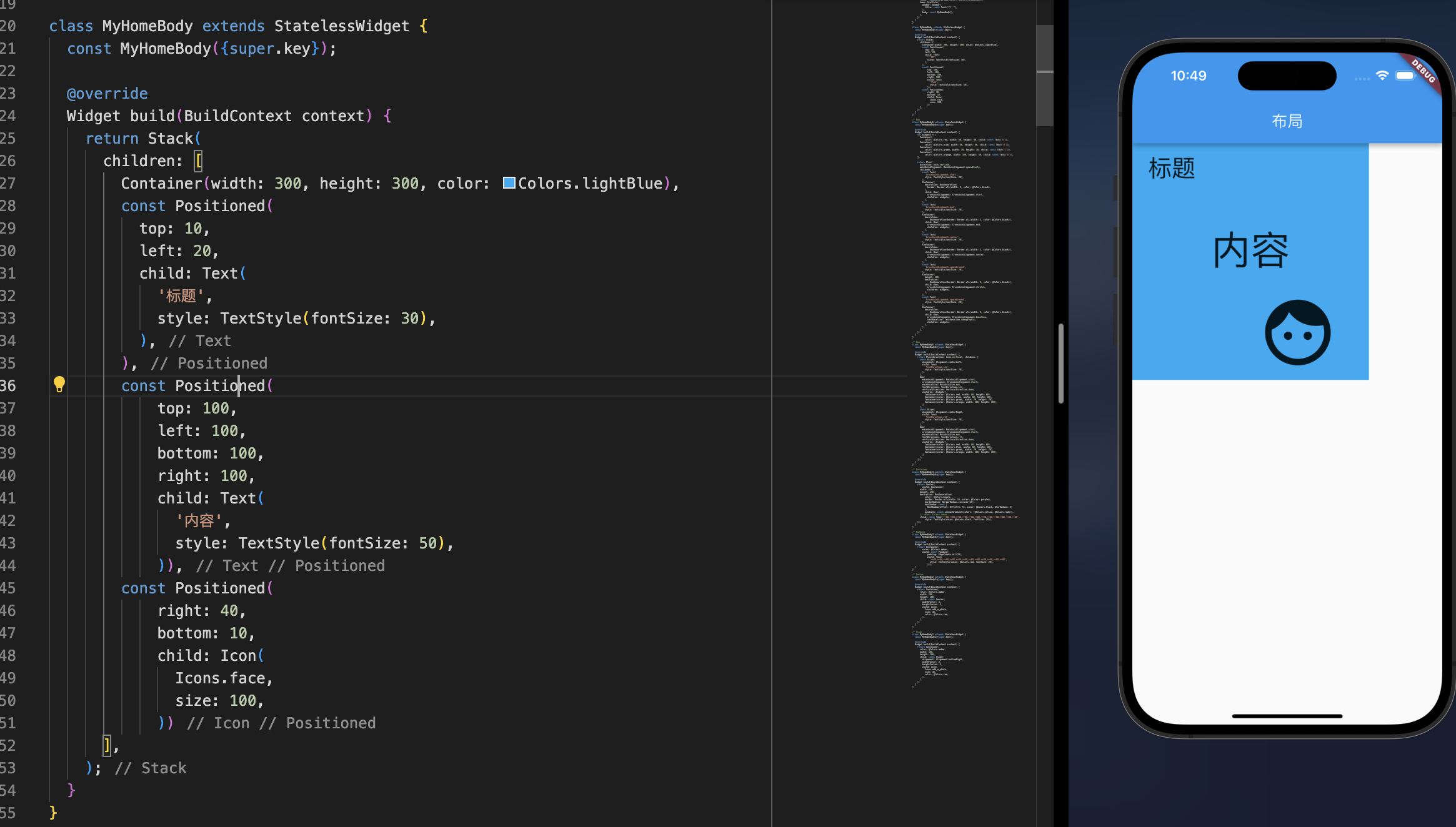
| class MyHomeBody extends StatelessWidget {
const MyHomeBody({super.key});
@override
Widget build(BuildContext context) {
return Stack(
children: [
Container(width: 300, height: 300, color: Colors.lightBlue),
const Positioned(
top: 10,
left: 20,
child: Text(
'标题',
style: TextStyle(fontSize: 30),
),
),
const Positioned(
top: 100,
left: 100,
bottom: 100,
right: 100,
child: Text(
'内容',
style: TextStyle(fontSize: 50),
)),
const Positioned(
right: 40,
bottom: 10,
child: Icon(
Icons.face,
size: 100,
))
],
);
}
}
|